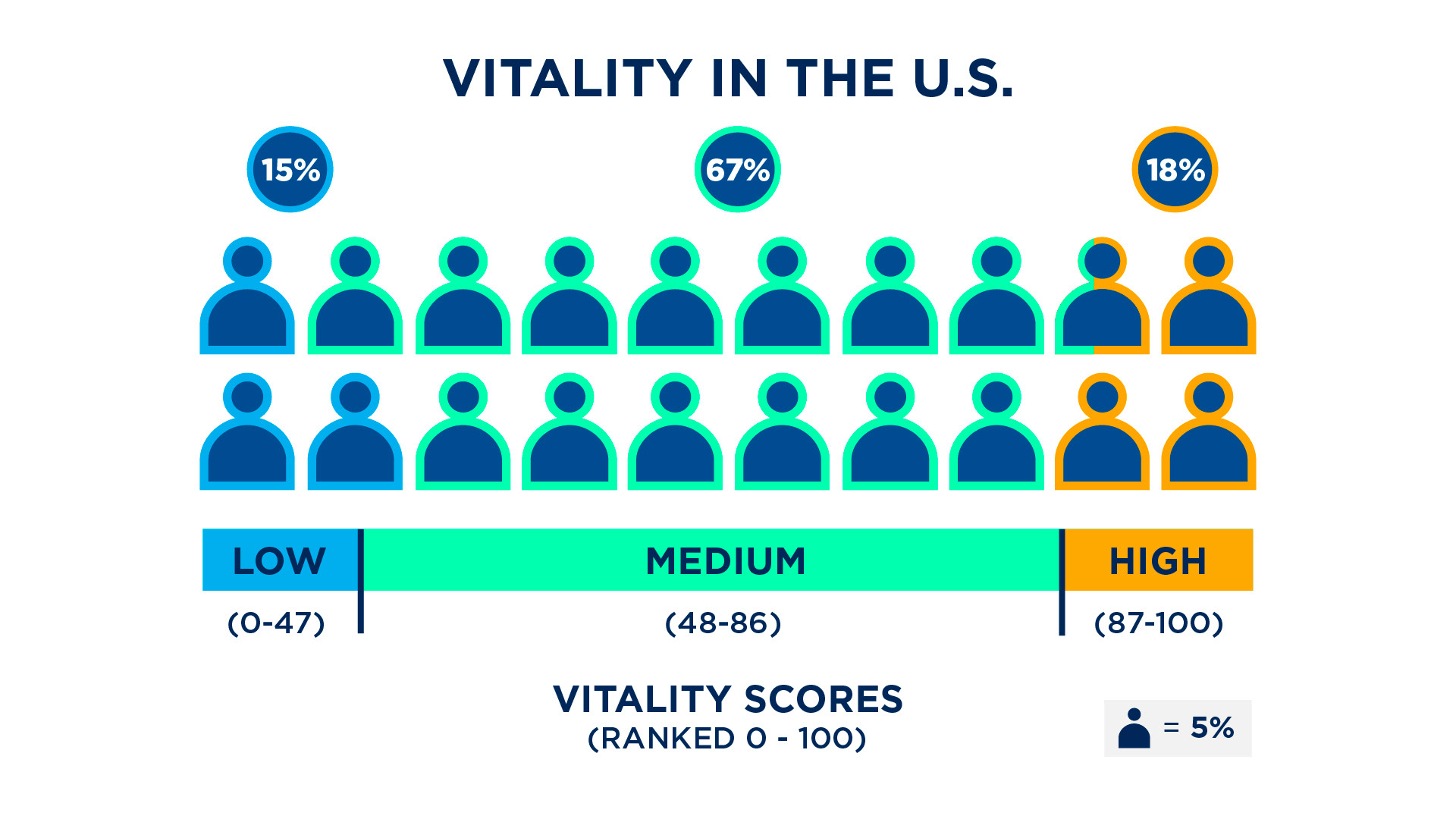
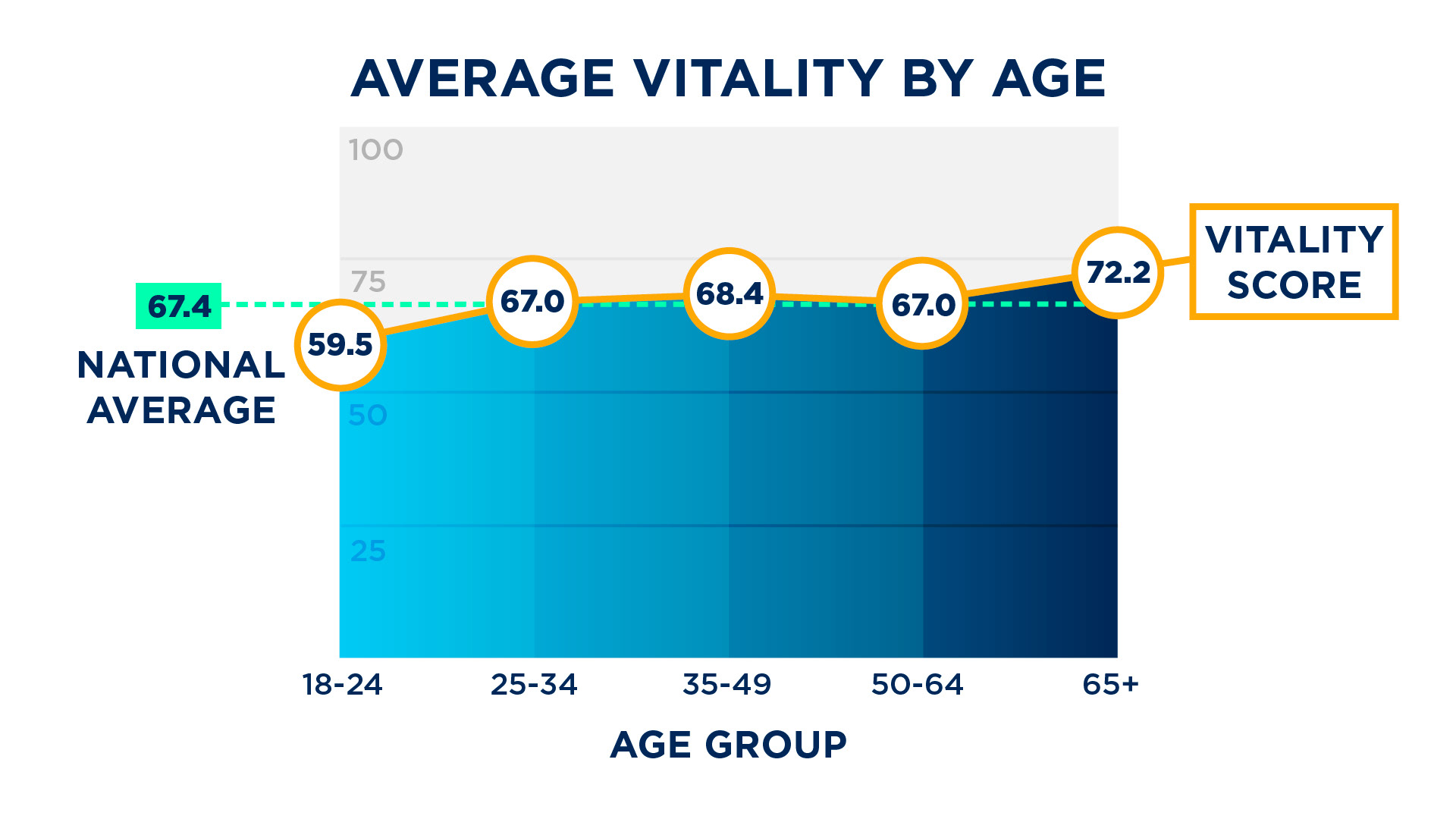
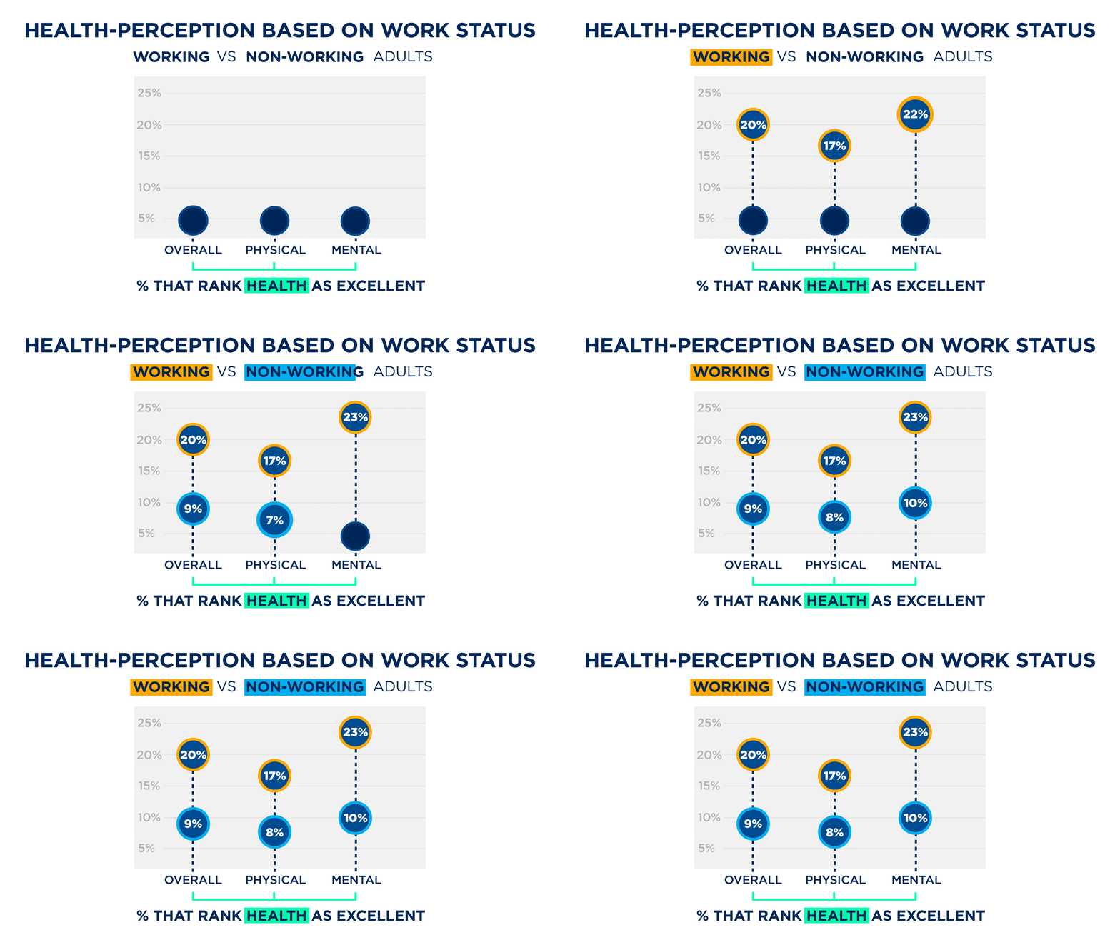
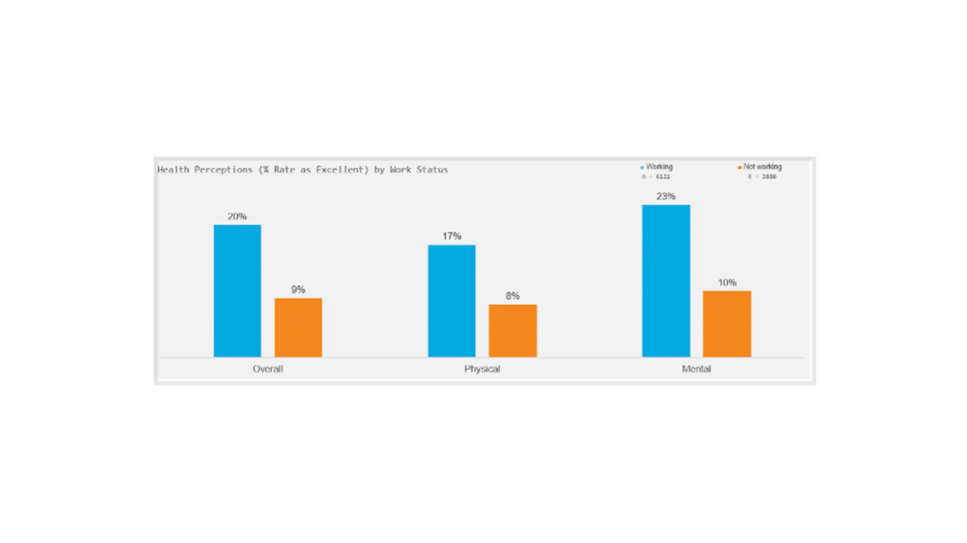
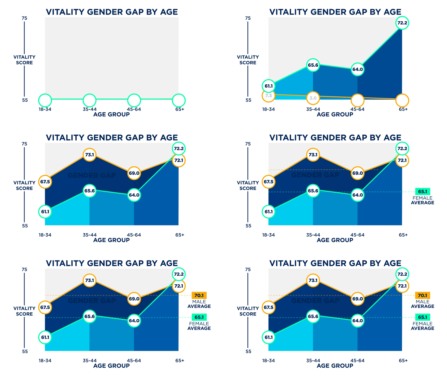
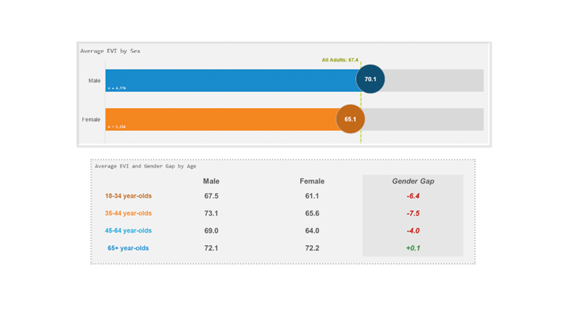
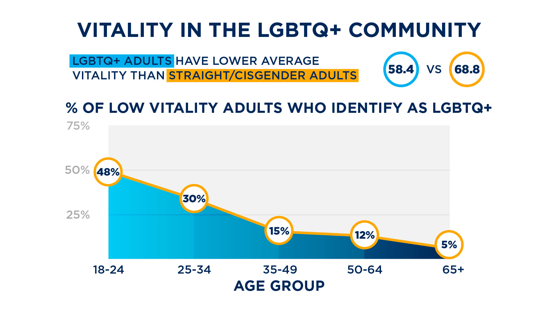
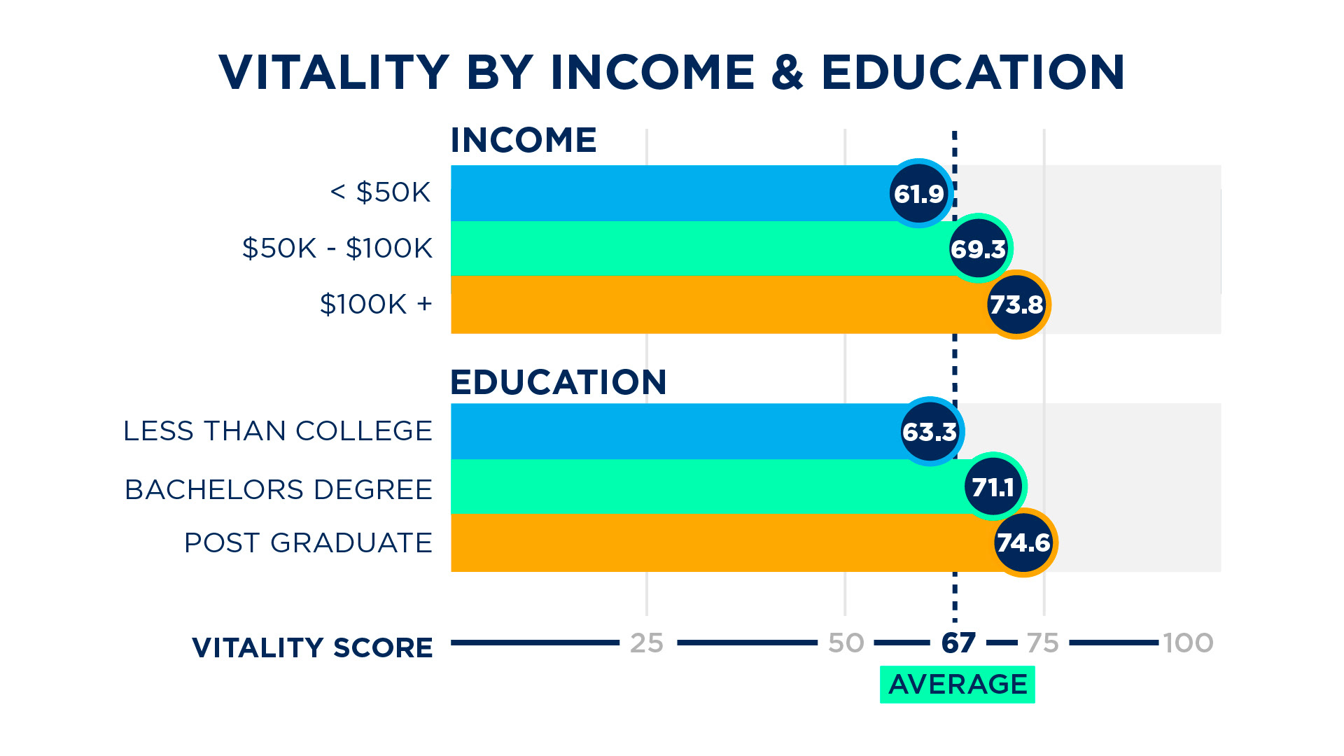
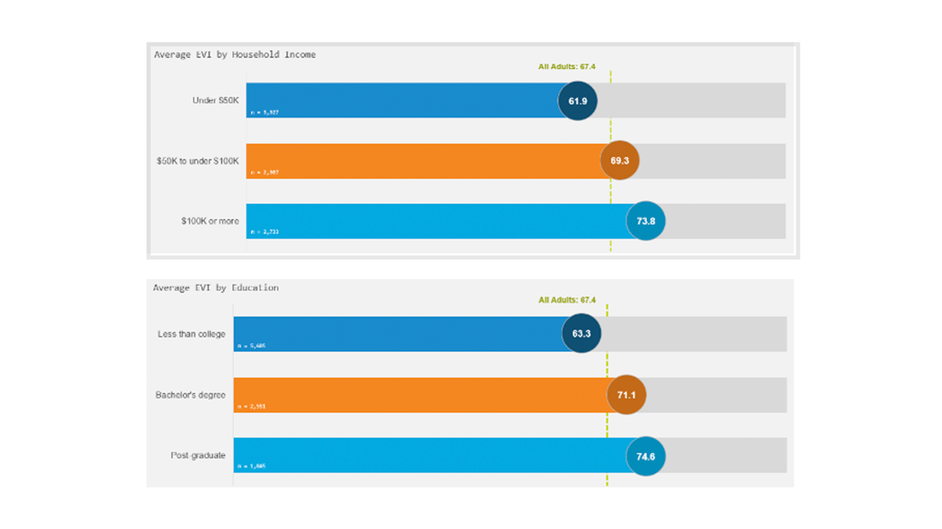
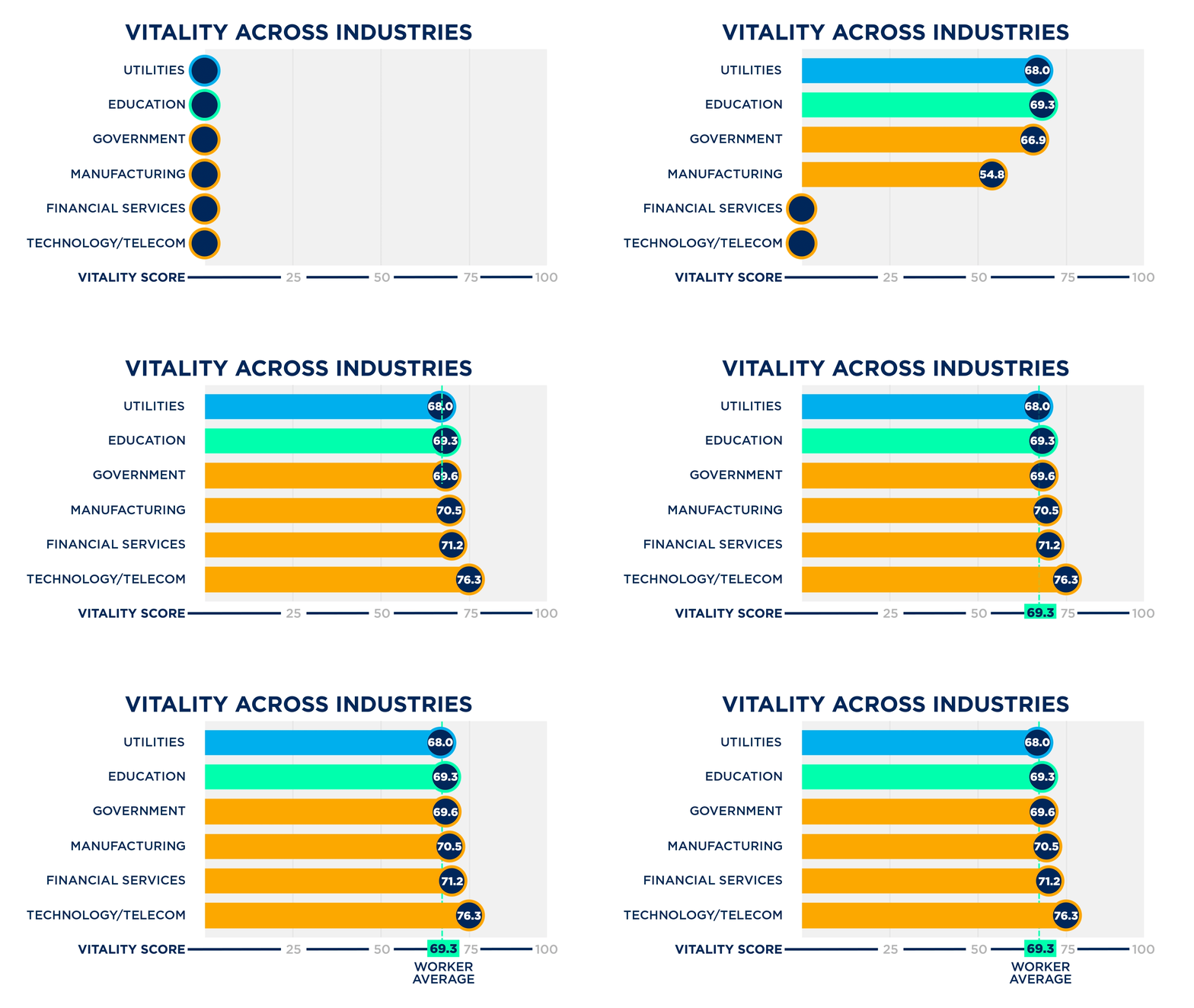
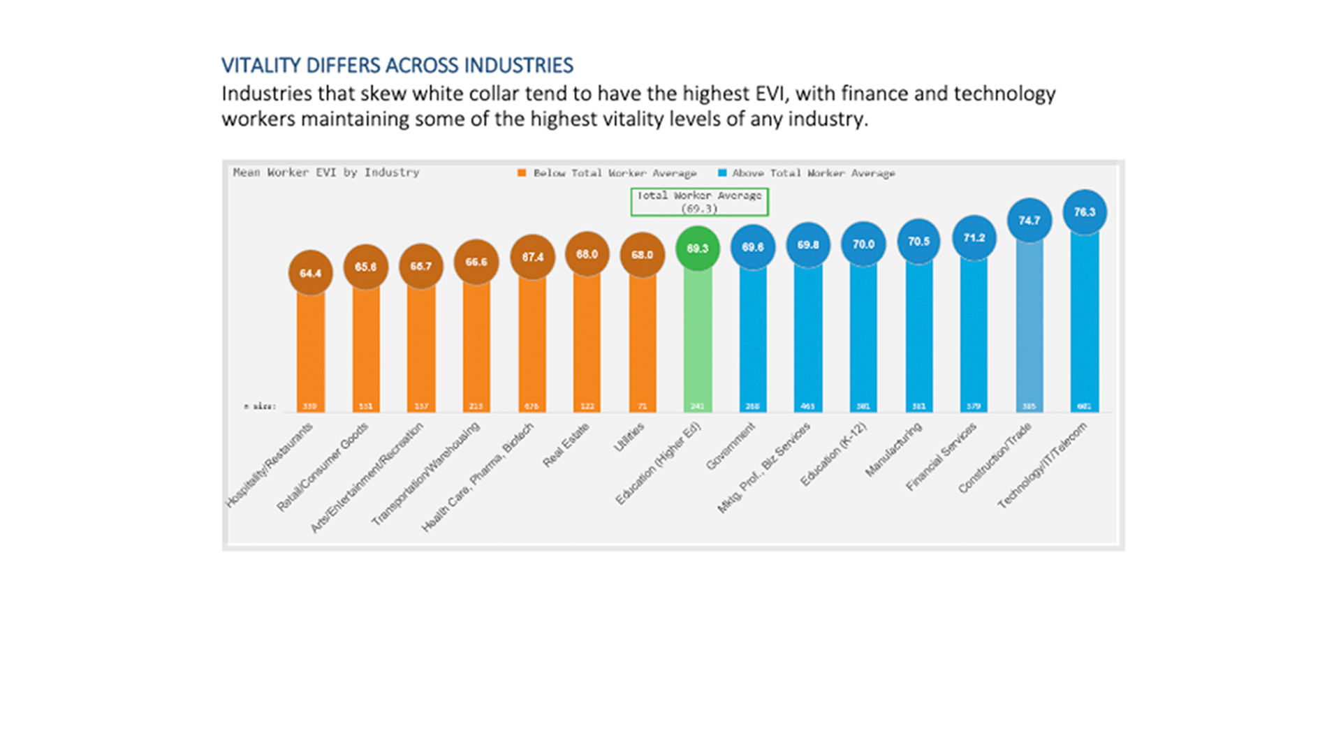
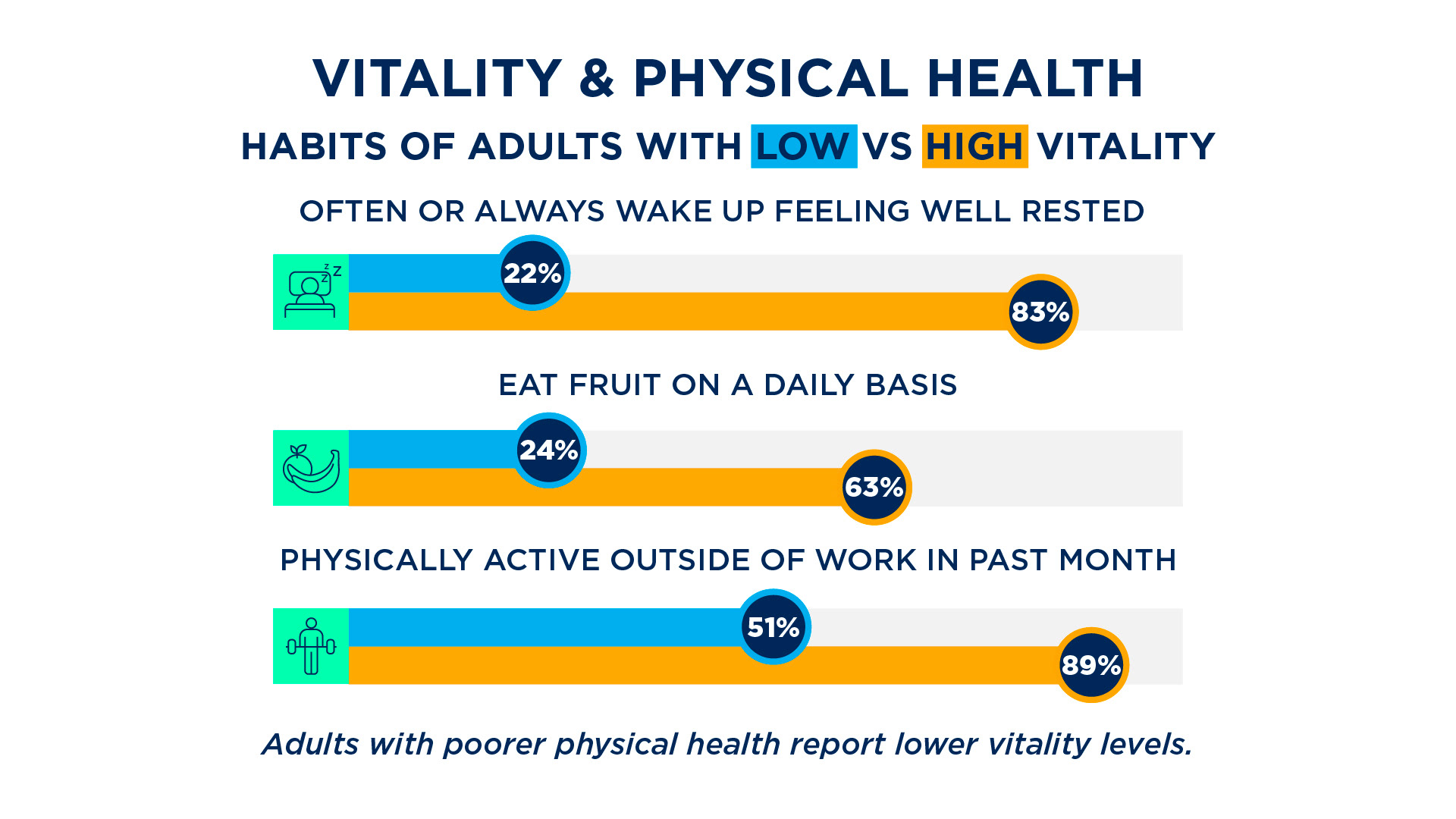
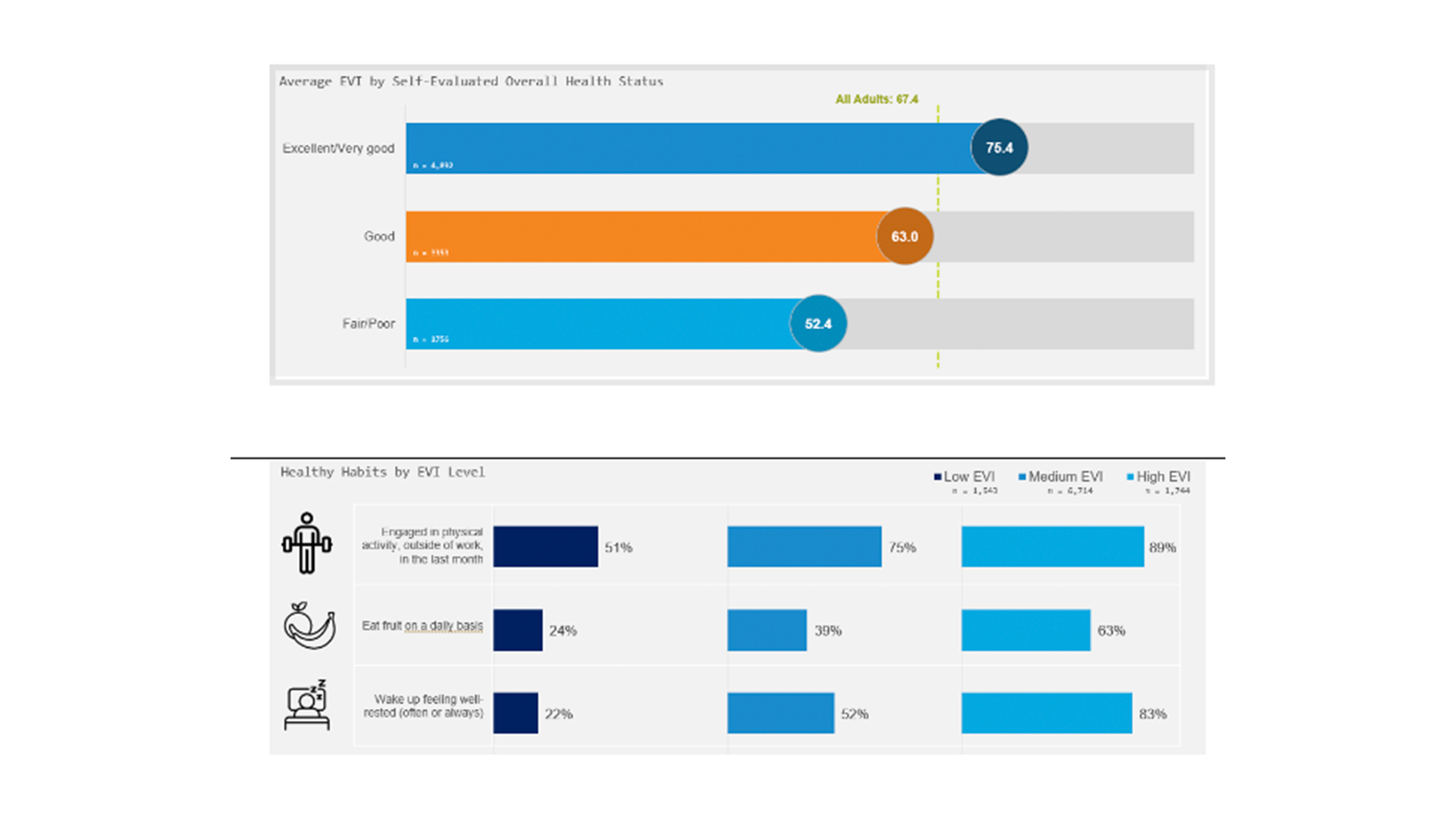
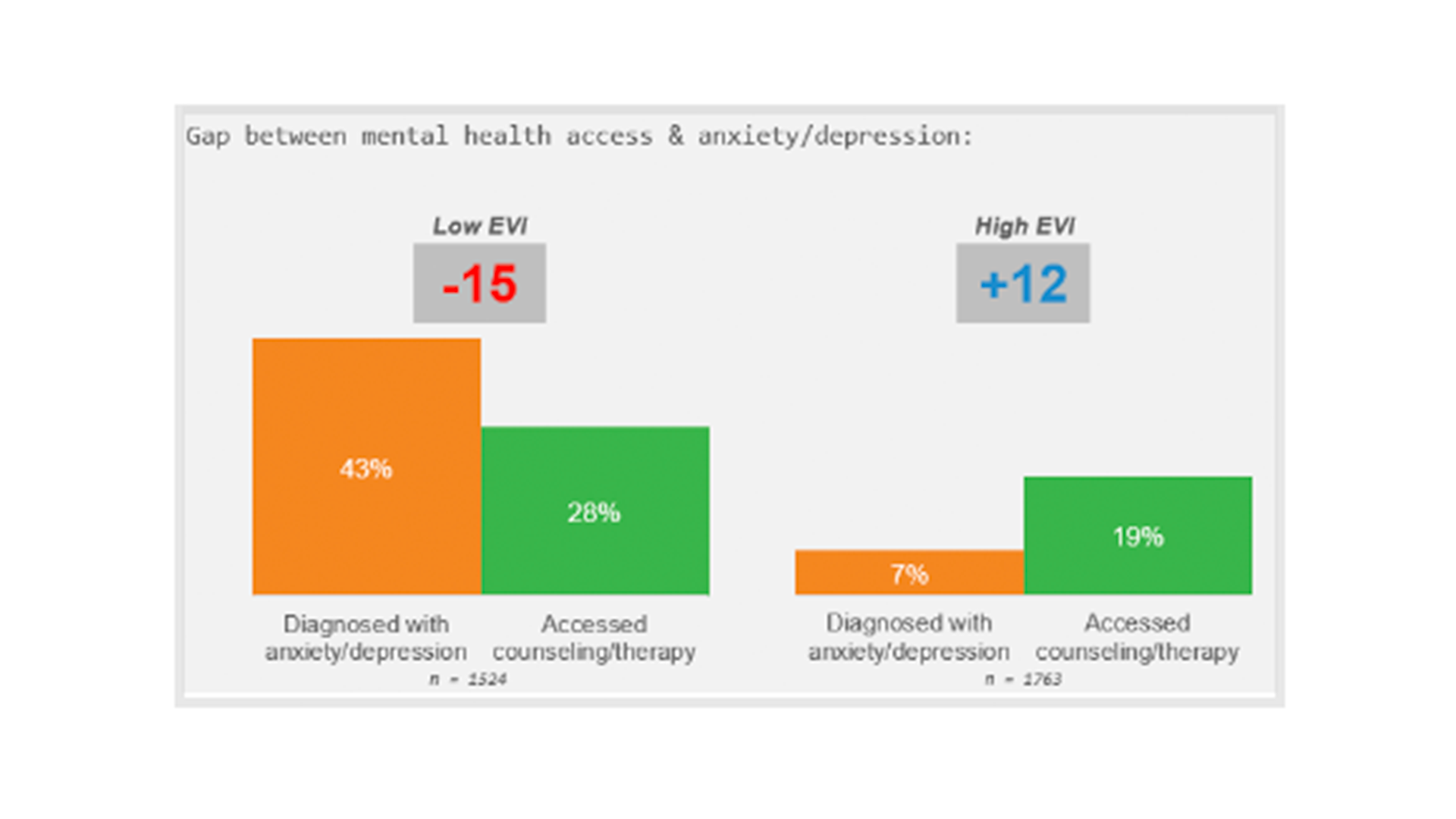
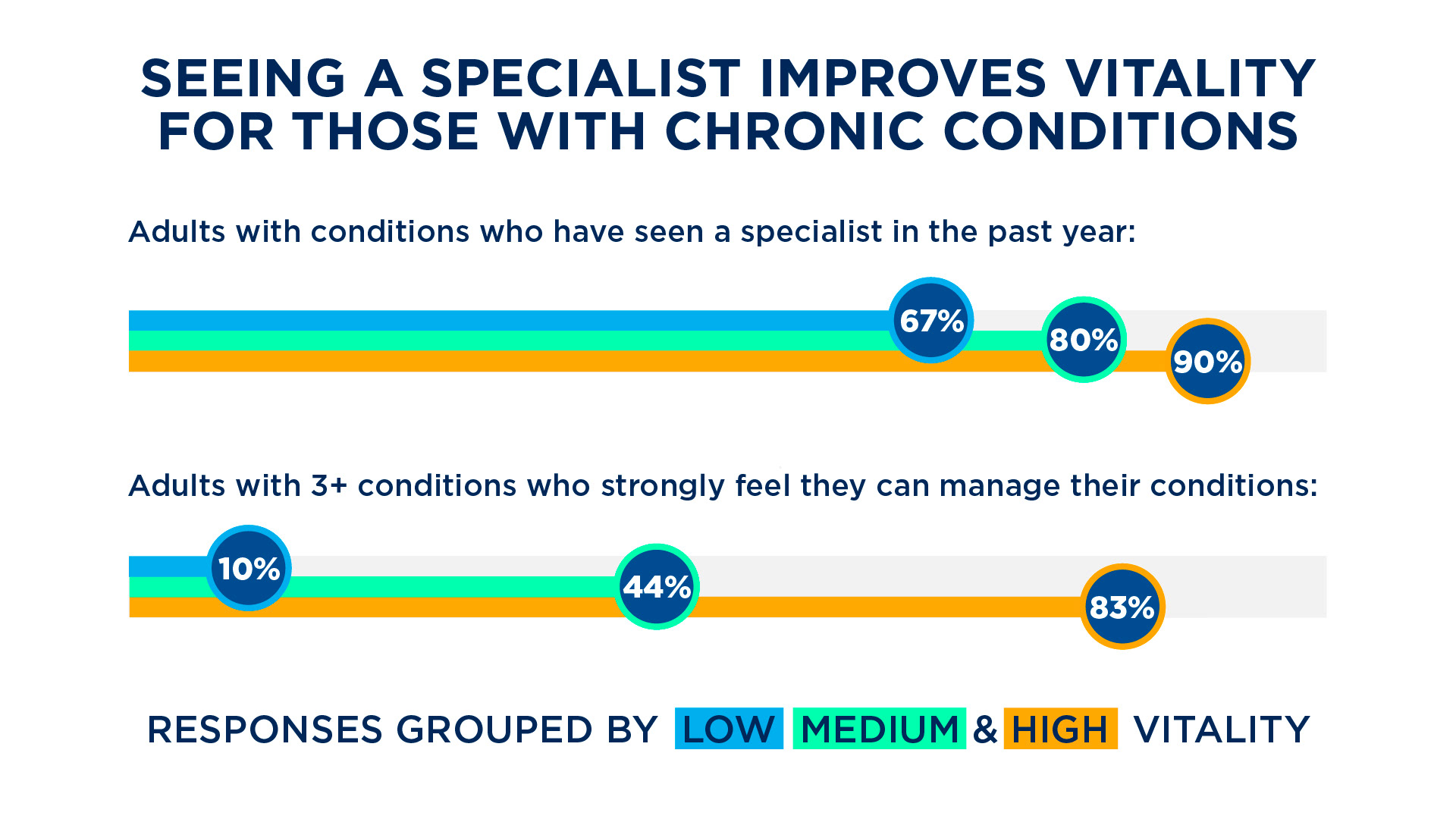
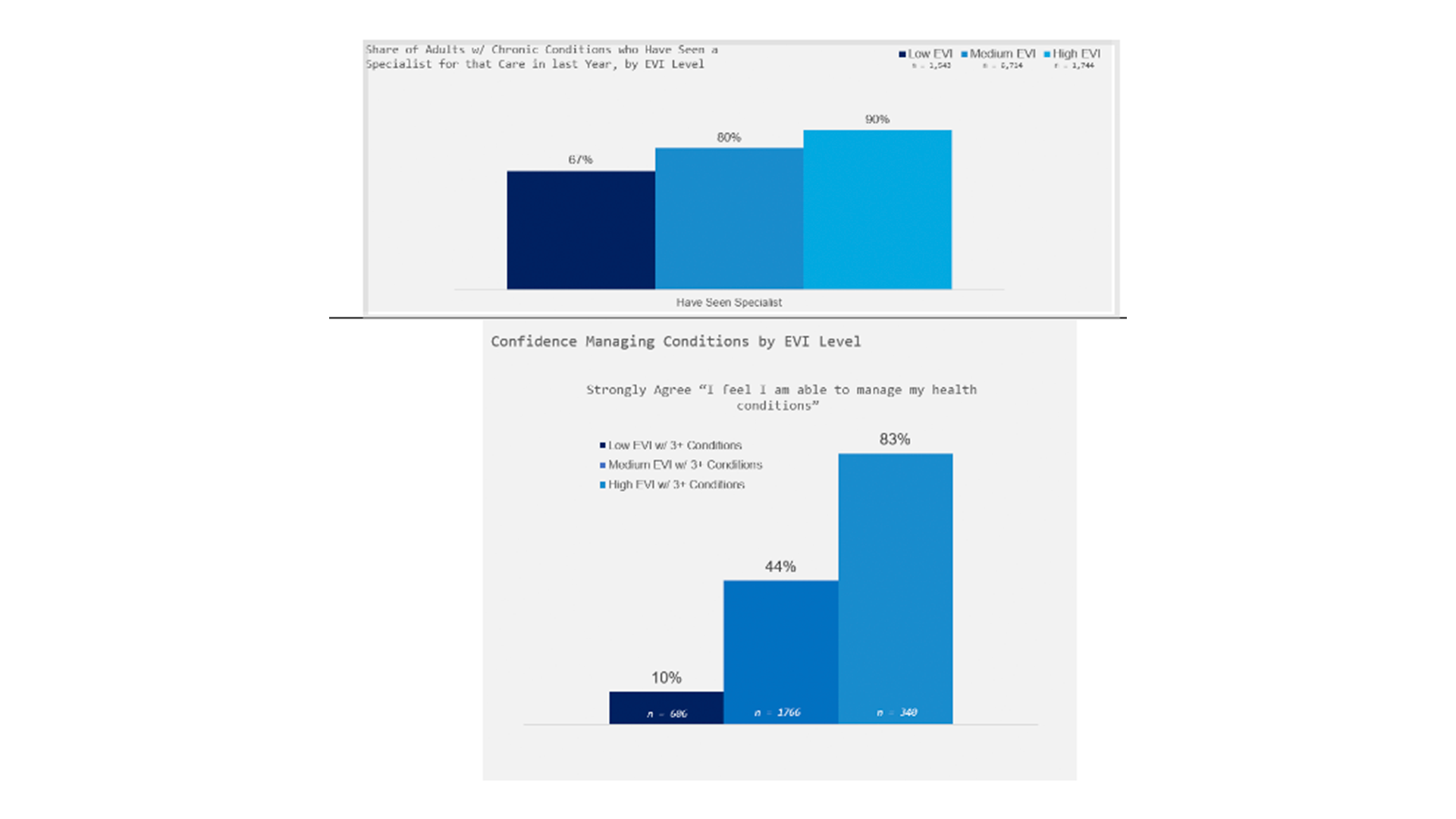
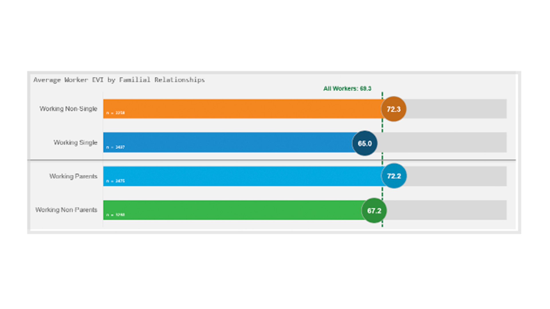
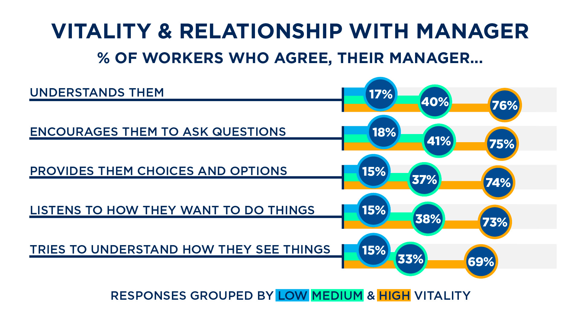
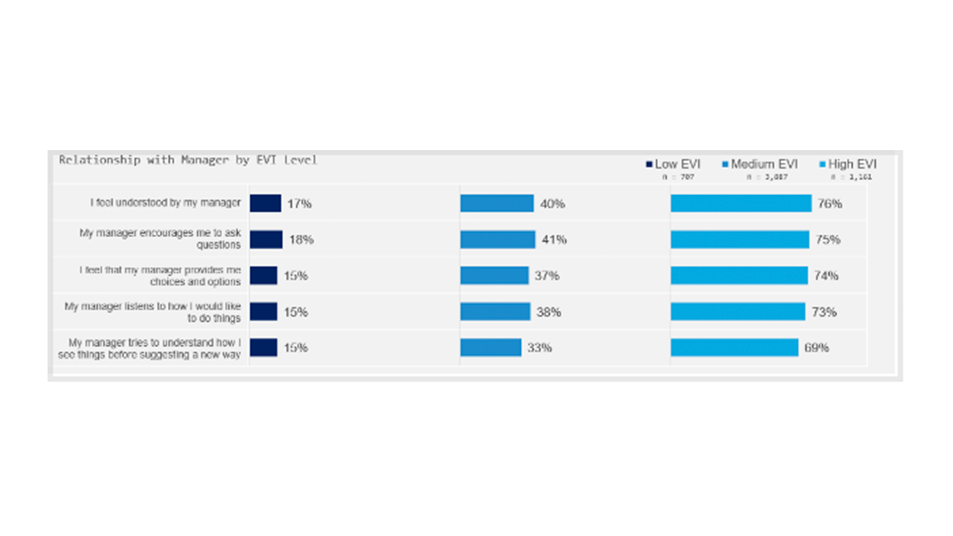
Cigna collaborated with psychologist Dr. Richard Ryan to develop a more wholistic measure of health, the Evernote Vitality Index. I created infographics and a logo for the final report. They were in the midst of a rebranding provided me with colors, but no brand toolkit. Below is the before and after. The infographics I created set the standard look for data in reports going forward.
Links: Cigna Vitality Report, USA Today
Logo
The team at Cigna wanted a clean logo for their Vitality related reports, that could be used both with and without text, showing how the pillars of vitality feed into overall well being. The self determination theory states that basic human psychological needs consist of relatedness, autonomy, and competence. Cigna wanted to move away from the often used Venn diagram style for graphics about vitality. We settled on a look that arranged the pillars of vitality in the form of the V, forming the foundation of well being.
Simplified Vitality Logo
Animated Vitality Logo
Report Graphics
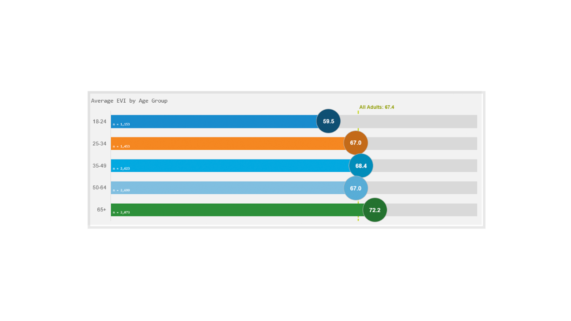
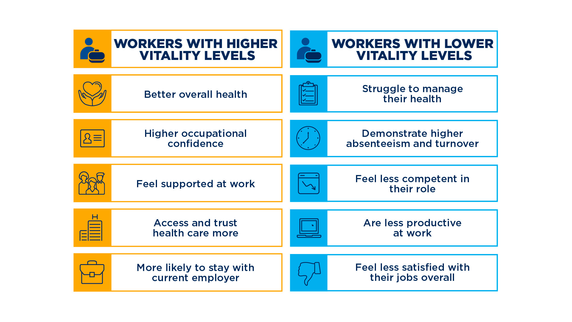
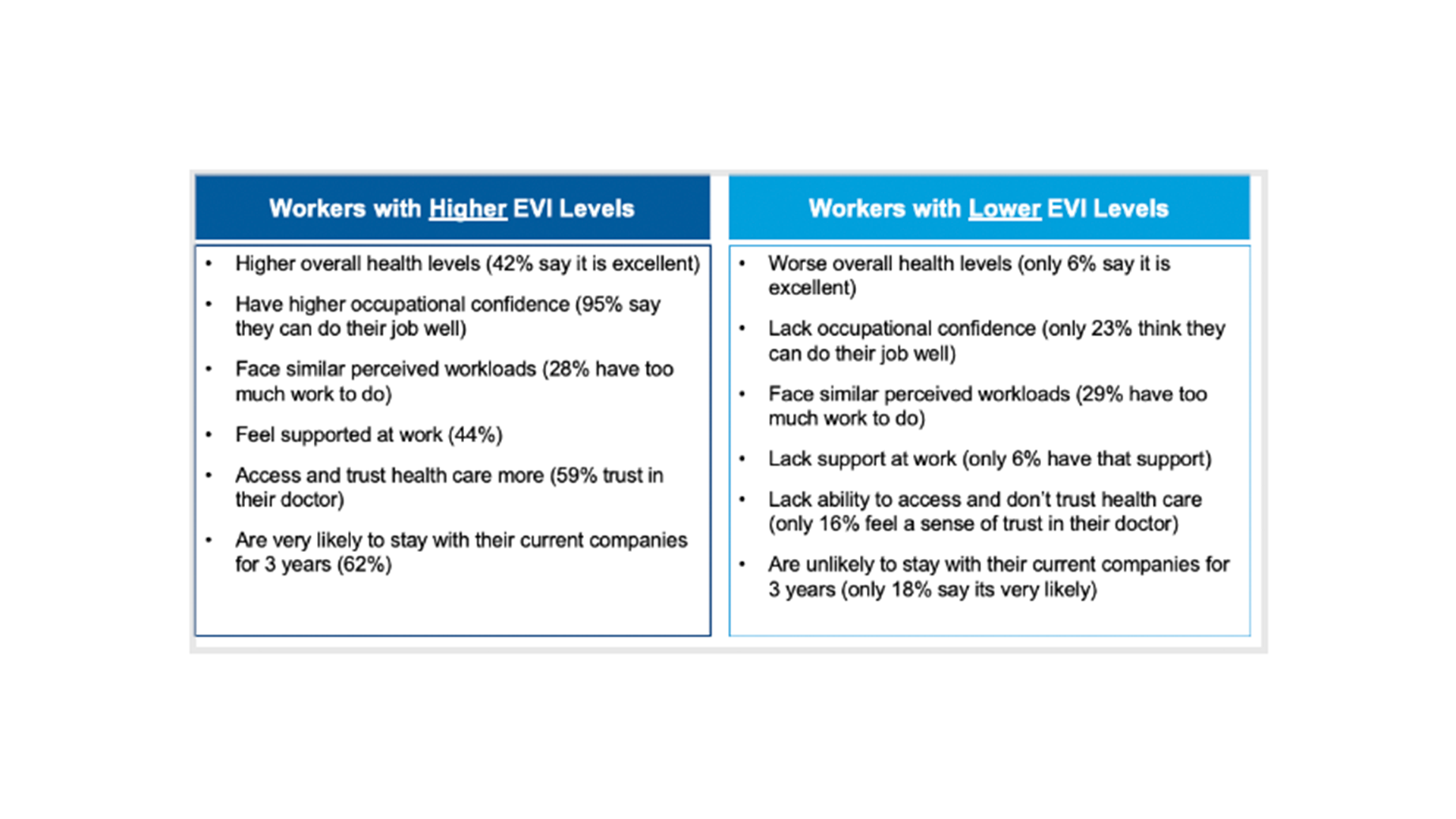
I designed the graphics below (left) based off the data from the report (right), integrating brand colors and iconography to create more reader friendly charts.
